Sub-Branding
The Notre Dame Web Theme is intended to provide consistency, but not uniformity.
It’s important that designers explore specific touches that tailor each website to its audience and subject manner. Designers should explore patterns, textures, backgrounds, photography, and additional (approved) colors.
Guidelines
- Any logos used in the header must be University-approved.
- Secondary and tertiary colors are permitted within the body of the site but may not be used to alter the color scheme of the global header and footer.
- Secondary and tertiary colors may be used for accents, but should account for no more than 25% of the site’s color palette.
- Accent colors and patterns should be used in a way that meets WCAG 2.0 level AA contrast requirements.
- Non-standard fonts may be used in graphic elements or lockups, but not for the site’s body copy or headings.
Logos
Units with University-approved logos are allowed to use those in place of the website title in the global header. Logos that are square, round, or vertically oriented are a poor fit—rectangular variations are recommended.
All logos must adhere to color contrast requirements WCAG 2.0 level AA over the Brand Blue header. For legibility, font sizes should be no smaller than 14px (0.875rem).
Multiple logos are not allowed. A header may include 1 logo on the left (to replace the site title) and 1 logo on the right (the University's academic mark).

- Vertically oriented logos are a poor fit for the Web Theme header.
- Logo does not adhere to minimum color contrast requirements.
- Font sizes in logo are too small.
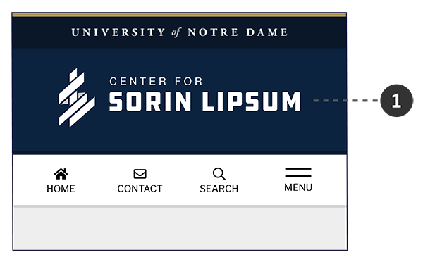
- This example logo meets Web Theme requirements.
If parent-level organizational references are necessary in the header, they should be included as part of the logo.
- Logo must be vertically centered on mobile devices
Accent Colors & Patterns
Accent colors, patterns, and textures can be added to the body of the website to provide variation. Backgrounds of content blocks, feature blocks, news listings, and events listings are common applications. Always maintain color contrast requirements (WCAG 2.0 level AA) and avoid using colored fonts.
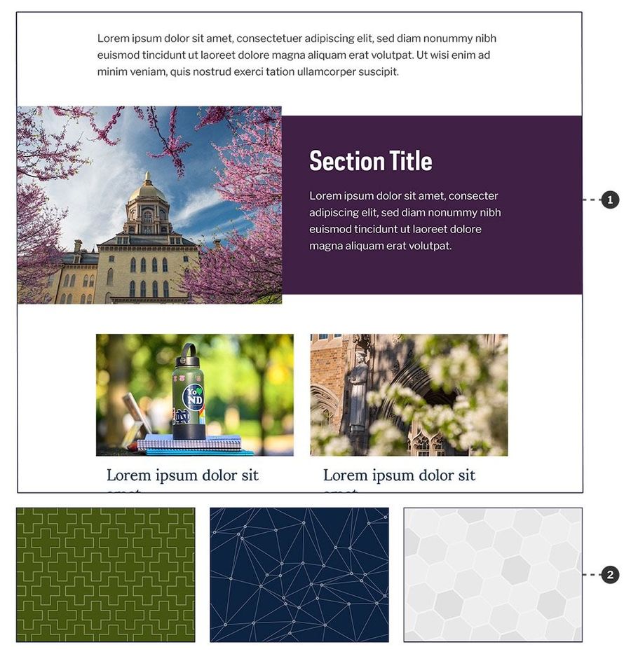
- Accent color is used as a background color.
- Site-specific patterns may be used for accents and background images.
Custom Fonts
The body fonts of the Web Theme (headings, body copy) should not be altered in any way. Non-standard fonts may be added for use as a graphic element or lockup (typically in the website header or feature area).
- Non-standard fonts may be used in graphic elements or lockups.
- Non-standard fonts may not be used in body copy and headings.
- Custom fonts may be used only as a graphic element or lockup (typically in the website header or feature area).