Buttons, Links & Cards
These elements lead our users to their next step. The UX patterns have been carefully researched and tested to ensure simplicity, accessibility, and adherence to best practices.
Guidelines
- The default button styles may not be altered.
- Links should maintain the default blue underlined style when used in body copy.
- Since a card acts as a single unit, each one should have no more than one link associated with it.
Buttons

- The default button style has medium contrast and is intended for most applications.
- All buttons have subtle animations on hover, including a change of background color and growth in size.
- All buttons have rounded corners.
In addition to the default buttons, there are other variations of buttons. These include:

- Call to Action (CTA) button: A high-contrast, larger-size button designed to attract the most attention. Use when there is a single call to action or actions tied closely to page objectives.
- More button: A right “more” arrow indicates a continuation of content.
- External button: An external link icon indicates a link to an external URL.
- Inline button: A low-contrast button intended for listing links or other low-contrast use cases.
Links
Links within the body use consistent colors and styles. When linking to certain common file types (.pdf, .doc, .zip, etc.), the Web Theme also appends an icon to the end of the link. This helps users know what they can expect when they click on the link.

- Links are blue and underlined when in body copy.
- Icons designate file type when linking directly to files for download.
Cards
A card is a grouping of content that can be part of a list, section, or stand-alone. By default, the font face of card titles is Sumana. Cards are intended to act as a unit, so if there is a link associated with a card, the entire card becomes clickable.
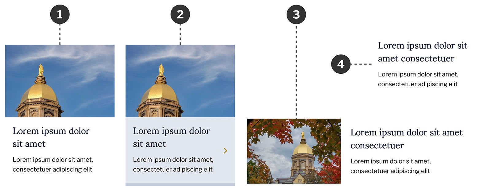
- Standard card layout with image includes place for image, title, and copy.
- On hover, the entire card may display bottom border and change background, or size only.
- Cards may use a horizontal variation.
- Cards may be used without image.