Page Headers
Page headers include a clear visual break from the global header and navigation, using breadcrumbs to assist users with navigational taxonomy.
Guidelines
- On desktop, any headlines or ledes in the header should be placed on the left side. Any images in the header should be either full-bleed or placed to the right.
- On mobile, all header images should go full-bleed.
- Breadcrumbs should be used when more than one level deep in site.
- Backgrounds should be one of the following:
- Light Gray background image
- Light Gray texture or pattern
- Full-color photography
Default Page
By default, the header of each page has a Light Gray background or texture with the page content pulled vertically over the top.
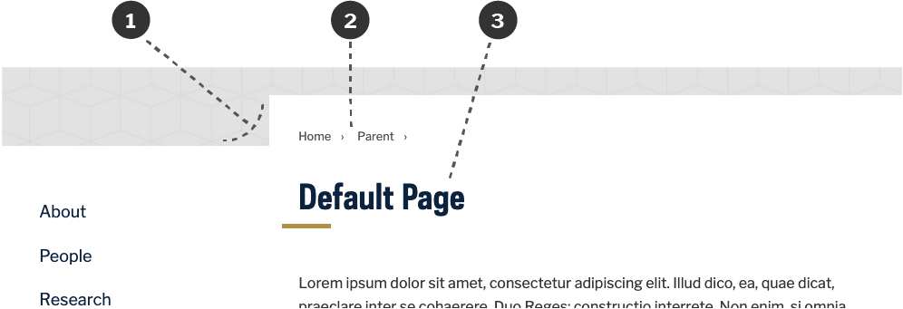
- The page content has a vertical offset over a Light Gray background.
- Breadcrumbs are placed above the page title. When the page title immediately follows the breadcrumbs, the current page is not shown in the breadcrumbs. Breadcrumbs are required for pages more than one level deep in the site.
- The page title is Brand Blue with a Brand Gold accent border.
Headline Variation
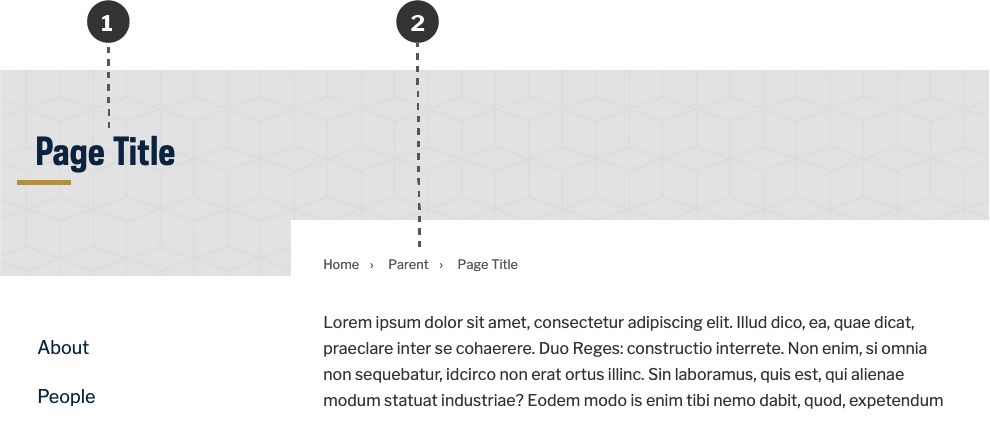
- The page title and accent border are placed over the light gray background, left-aligned with the site title and any side navigation.
- The breadcrumbs remain in same place, but also include the current page title.
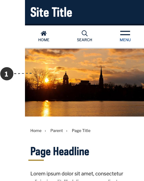
Default Hero Image
By default, hero images are pulled to the right side of the header, with page headlines and ledes placed to the left.
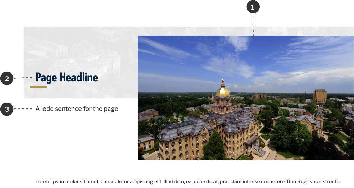
- A featured image may be placed in the header. By default, it fills the right side of the screen.
- The page title/headline is placed to the left of the page, left-aligned with the site title.
- A lede sentence may go below the headline.
Full-Bleed Hero Image
Full-bleed images may be used in the header of the page. The main requirement is any text overlaying the image should have a solid background to ensure legibility and sufficient contrast.
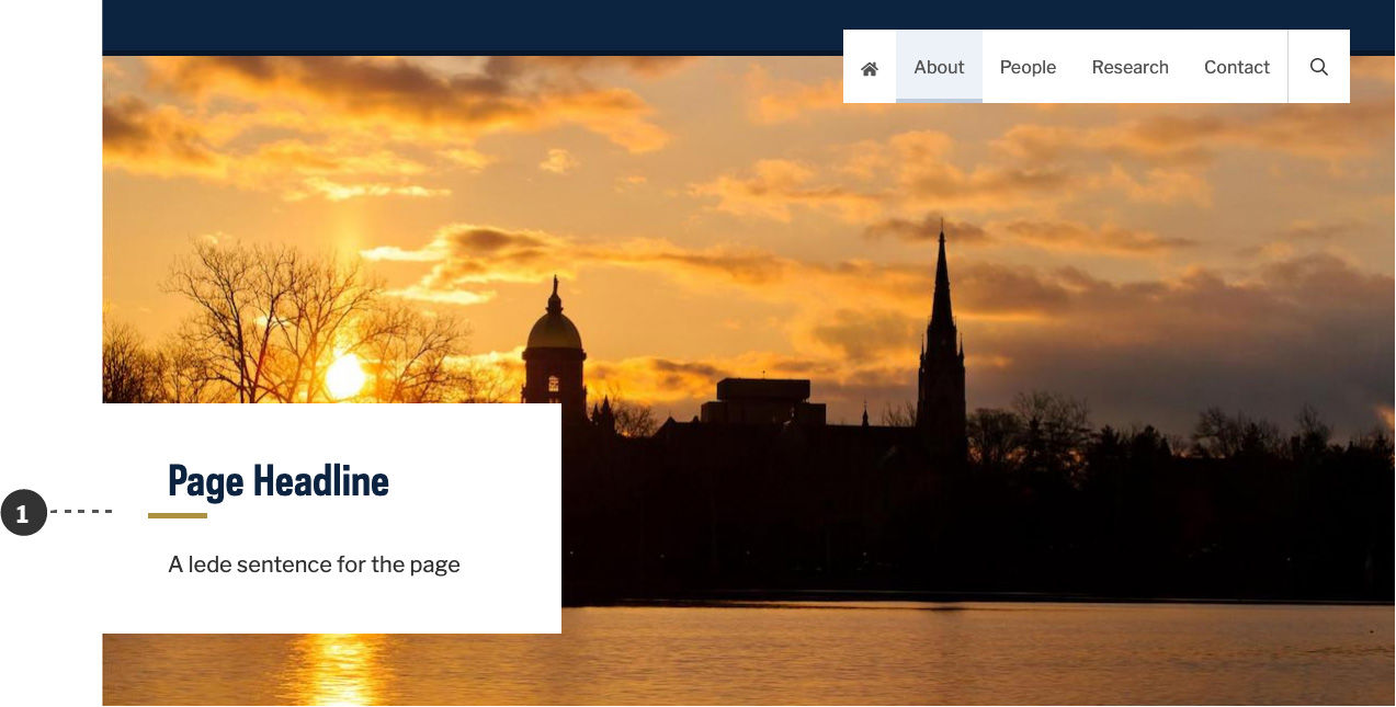
- The page headline and lede have a solid bounding box to ensure optimal readability.
Mobile
On mobile, the light gray background is not displayed. Any header images go full-bleed, with the breadcrumbs, headline, and content being stacked below.
- The header image goes full-bleed above content. Everything else is stacked below.