Global Header & Footer
The Web Theme’s common header and footer provide immediate brand recognition and give users a sense of consistency as they move from site to site.
The header and footer were designed to mirror each other in their feel, providing a consistent start and end to each page. For additional reference information, visit the Global Header and Footer page in the Documentation section.
Guidelines
- The colors, layout, and styles of the global header and footer may not be altered.
- Custom logos may be used in the header in certain circumstances. Visit the Sub-Branding page for more details.
- Animated logos within the global header and footer are prohibited.
Header
Desktop
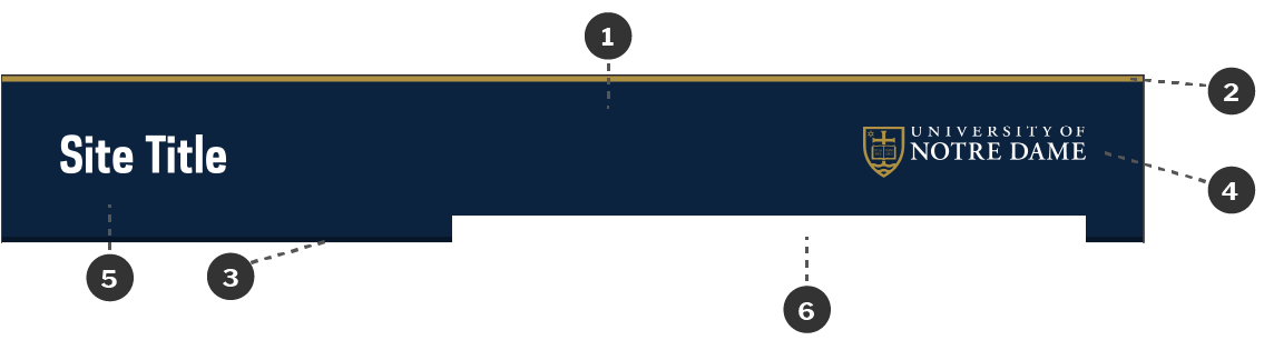
- The background color of the header is Brand Blue.
- The top border is 5px of Brand Gold.
- The bottom border is 5px of Dark Brand Blue.
- The academic mark is placed in the top right corner of the header. It is 200px wide, with approximately 40px padding top and bottom.
- The site title is located on the left side of the header and vertically aligned with the mark. The title font is Galaxie Polaris Condensed Bold in white.
- There is always a place for navigation/search aligned to the right edge of the mark. If the site uses side navigation instead of top navigation, this spot is used solely for search.
Variations
There are multiple variations of the way the site title can be displayed, with options for displaying a parent unit or a tagline along with it.
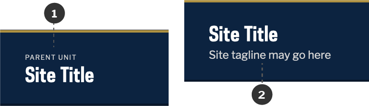
- The parent unit may be listed above the site title. It is displayed in all-caps and Light Gray, and uses Libre Franklin. Do not include more than 1 unit.
- A tagline for the site may be listed below the site title. It is displayed in Light Gray and uses Libre Franklin.
Logos
The Web Theme can accommodate logos in the Site Title area, as long as they meet accessibility and style requirements. Visit the Sub-Branding page for more details.
Mobile

- On mobile, a white word mark over Dark Brand Blue is used in place of the standard academic mark.
Footer
Desktop
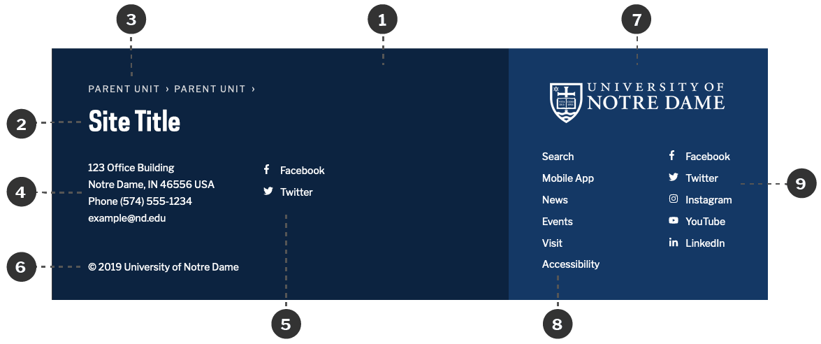
- The background color is Brand Blue with white copy.
- The site title is displayed prominently, using similar sizing and styles as the title in the header. Taglines are not acceptable in the footer.
- A parent unit may be displayed above the site title and linked to another website. An additional organizational tier (grandparent unit) may also be included.
- The site’s contact Information is displayed to the left of the footer.
- Space for a site’s social media links is to the right of the site’s contact information.
- The University’s copyright notice is always in the bottom left-hand corner of the footer.
- The academic mark is used to designate University-specific information. Unlike the header, this mark is entirely white and goes over the Light Brand Blue background color of this section.
- Key University links are always present below the mark.
- The University’s social media channels are also listed below the mark.
Mobile
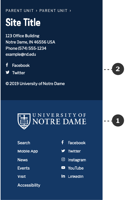
- University information is moved to very bottom on mobile.
- The site’s contact and social media links are stacked vertically instead of side-by-side.