Navigation & Search
A simple, user-friendly experience is achieved with clear, visible navigational tools including search.
Guidelines
- The style and location of site navigation may not be altered.
- A top navigation may be used only when the number of items (and characters) allows for it. If the top navigation is not able to be displayed normally at 960px, or if any of the navigation items break to a second line, a side navigation must be used. A top navigation that has six or fewer items works most of the time. Use this tool to test your site navigation length.
- If a site has more than one page, the search bar must be present.
- On mobile, a full site navigation must be present on the bottom of every page.
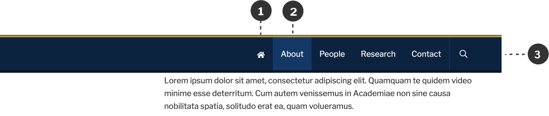
- A link to the home page must be present as the first item within the sticky navigation.
Desktop
There is always a place for navigation and search in the header, aligned to the right edge of the mark. If the site uses side navigation instead of top navigation, this spot is used solely for search.
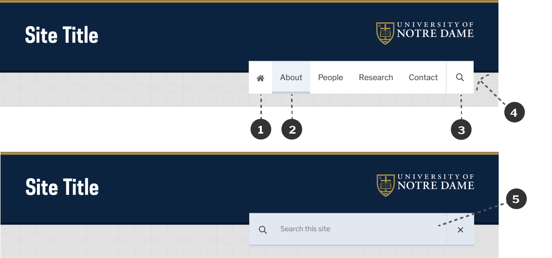
- A home icon may be used in place of the word “Home.”
- Sky Blue is used for the active and hover states of navigation items.
- The search icon is always located to the right.
- The navigation overlaps the global header, with the bottom of the global header aligning with the top of the text in the navigation.
- When the search icon is clicked, the search box expands to fill the navigation bar.
Sticky Navigation
When top navigation is used, a sticky navigation bar will appear when the use scrolls down the page. This navigation contains the same content as main top navigation, but uses a different color scheme.
- A link to home is always present in the sticky navigation.
- Light Brand Blue is used for the hover and active states of navigation items.
- The color scheme of the sticky navigation matches the global header. It has white text on Brand Blue, a Brand Gold top rule, and a Dark Brand Blue bottom rule.
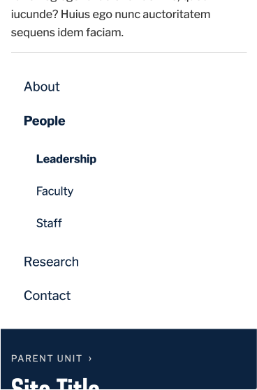
Side Navigation
In addition to the header, the Web Theme also uses the left side of the page to place any additional navigation items. If a top navigation is not used, the main navigation of the site is placed here. Otherwise, it is used for navigation within sections of the site.
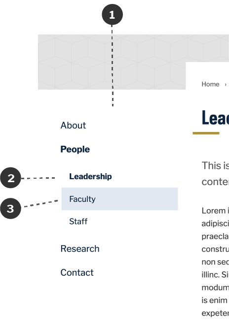
- Navigation is placed to the left of the page content, left-aligned with the site titles in the header and footer.
- The current sections and the current page are designated by the use of bold.
- Sky Blue is used for the hover state of navigation items.
Mobile
On mobile, a consistent navigation bar is used for every site.
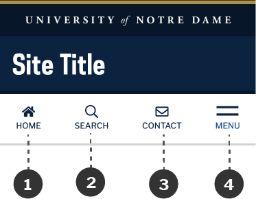
- A home icon is always present.
- A search button is always present for sites with more than one page.
- The contact button is optional. When used, it links to the site’s contact page.
- A menu icon is used to display the offscreen drawer, which contains the full navigation for the site.
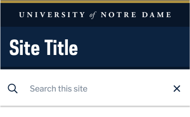
When the search button is clicked, the behavior is similar to desktop. The search file expands to fill the navigation bar, and a close button subsequently appears.
When the menu button is clicked, the offscreen drawer slides in.
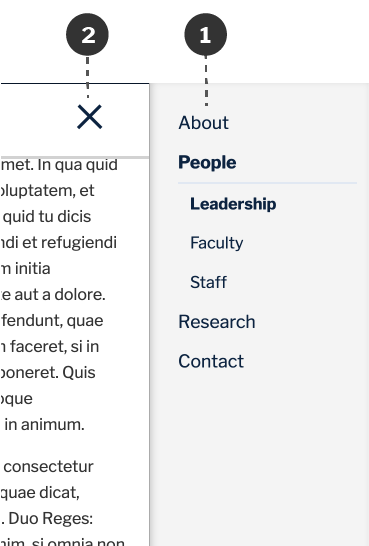
- The mobile drawer includes the full navigation for the site, displayed over a Light Gray background.
- A close button allows users to close the drawer and return to the page.
Footer Navigation
On mobile, the full site navigation is also present at the bottom of every page. It provides a stable fallback in cases where the drawer doesn’t load properly. This navigation follows the same color scheme as the side navigation on desktop.